
OVERVIEW
DocuWare is a robust SaaS product that allows for deep and complex storage, recall, and manipulation of information and tasks related to an organization’s documents. The processes that surround these activities can be quite complex. The Workflow Designer is meant to simplify and automate many of the interactions and tasks found within the core product.
The current DocuWare Workflow solution had been developed as a standalone “Windows-only” desktop app. This situation served its purpose for some time, but as DocuWare grew, some of the shortcomings of this desktop app became clear:
- The user base was limited to Windows users
- Development required a “monolithic” release process
- Maintenance and version-dependent support became increasingly fractured
To address these issues and more, stakeholders set the initial scope for the project to move the existing features of the desktop app to the same browser-based platform that most of the core DocuWare product is built upon. This was expected to include minor adjustments to the usability and interface to properly migrate pre-existing customer workflows.
MY ROLE
I acted at the sole UX designer during the first phase of the project until the planned release to a very limited group of organizations as a live pre-beta release. I worked to coordinate and implement all areas of UX and including the creation of many layouts from simple wireframes to complex, data-driven interactive testing prototypes. and combined my efforts with a reliable UX Research specialist, product owner, and SCRUM team of 9-12 engineers while assisting with prioritization and grooming of the backlog.
DESIGN SYSTEM
I also implemented and maintained a tokenized component library. The SCRUM team and I had several discussions about how to create and hand off those components and it was decided that they would be designed in Adobe XD which has a basic design component library management built in. It was complex enough to provide the components, states, and styles needed, but simple enough that the learning curve for the development team was much lower than what it would be with more advanced systems.
COLLABORATION
I worked closely with all stakeholders, including the SCRUM team to foster an internal team policy of open communication with all team members, allowing us to be the most agile we could. Additionally, I worked with team stakeholders to help manage and update a running Gantt chart between discovery, design, testing, and development
This was a redesign of an entire product, so it was imperative to establish a definitive process in order to avoid confusion over time. Luckily we had already developed a strong procedural flow within the UX team that easily translated to this Epic.
Defining personas
The determination of target personas came through a combination of early internal and external interviews, a collection of additional user suggestions from our User Voice channels, and usage metrics from the currently available workflow desktop application.
- Primary – Power User: An IT professional employed by the DocuWare customer. This person has some Development background and is comfortable digging into the nuts and bolts of the product to get what they want done.
- Secondary – Advanced Partner: A certified external salesperson who tends to take a form of setup and maintenance administrator for an organizations DocuWare service. This person will, at times, hand some of the more complicated work to someone with more development skills.
- Potential – Administrator: An employee within the DocuWare customer’s organization responsible for defining daily operations. This person has little to no experience with building logic-based automated decision trees.
I, along with the UX researcher and product owner devised a series of day-long workshops for users that coincided with our top tier of Personas. We were able to determine several pain points and areas of blockade:
- The current interface was too cluttered and structured in an unintuitive way.
- We allowed groups of participants to describe a general wireframe that would emphasize the hierarchy they desired while designers helped to sketch them out.
- There were important features missing that users felt would help them greatly.
- We used dot-ranking and open forum discussions to identify the features that users found to be the highest priority.
- We had initially hypothesized that features that would help describe and guide a user would be top of the participant’s list.
- it turned out that the most valuable features centered around error and validation tracking, automatic assignment of a document’s data, and the simplification of conditional statements that change the direction of a workflow.
- The initial the scope was too narrow (as stated above) as many findings pointed to an expanded design beyond what had been planned
Designing and implementing a product requires an iterative process, so we continued to have several, more focused workshops for features such as the conditional flow and data assignment interfaces.
To address the issues brought up in the workshop and more, stakeholders set the initial scope for the project to move the existing features of the desktop app to the same browser-based platform that most of the core DocuWare product is built upon. This was expected to include minor adjustments to the usability and interface to properly migrate pre-existing customer workflows.
USER FLOWS
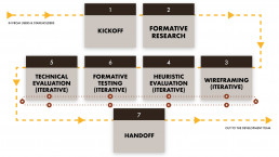
I would typically begin each feature by defining possible user flows needed to address a particular challenge and with the help of my peers, narrow them down to most logical series of steps a user might need to go through. In the image behind one can see examples showing the general flows from several different use cases.
WIREFRAME & PROTOTYPE TESTING
I like to have a mixture of quantitative and qualitative information to base user experience and user interface design decisions on. The UX team (including myself) created a testing process that merged direct dialog and observation with users during prototype usage with a questionnaire that rated the prototype usability by the users on a scale, and usage statistics collected by out team’s product data curator. With this collection of results, we were able to not only see where we were succeeding and failing, but also within the right context.
Example 1: Line Drawing
We tested several approaches to testing the shapes, thickness, and automated path drawing of the workflow path lines.
“I do like how the lines can
take a more direct route in
this option.”
After mutliple tests, we found that users preferred to use squared lines that automatically avoided item collision, even if it meant the lines were drawn with many angles, as long as users could manually adjust afterwards. Also, as the lines moved behind items when moved manually, it was best to show the line faintly above the item to help with visual continuity.
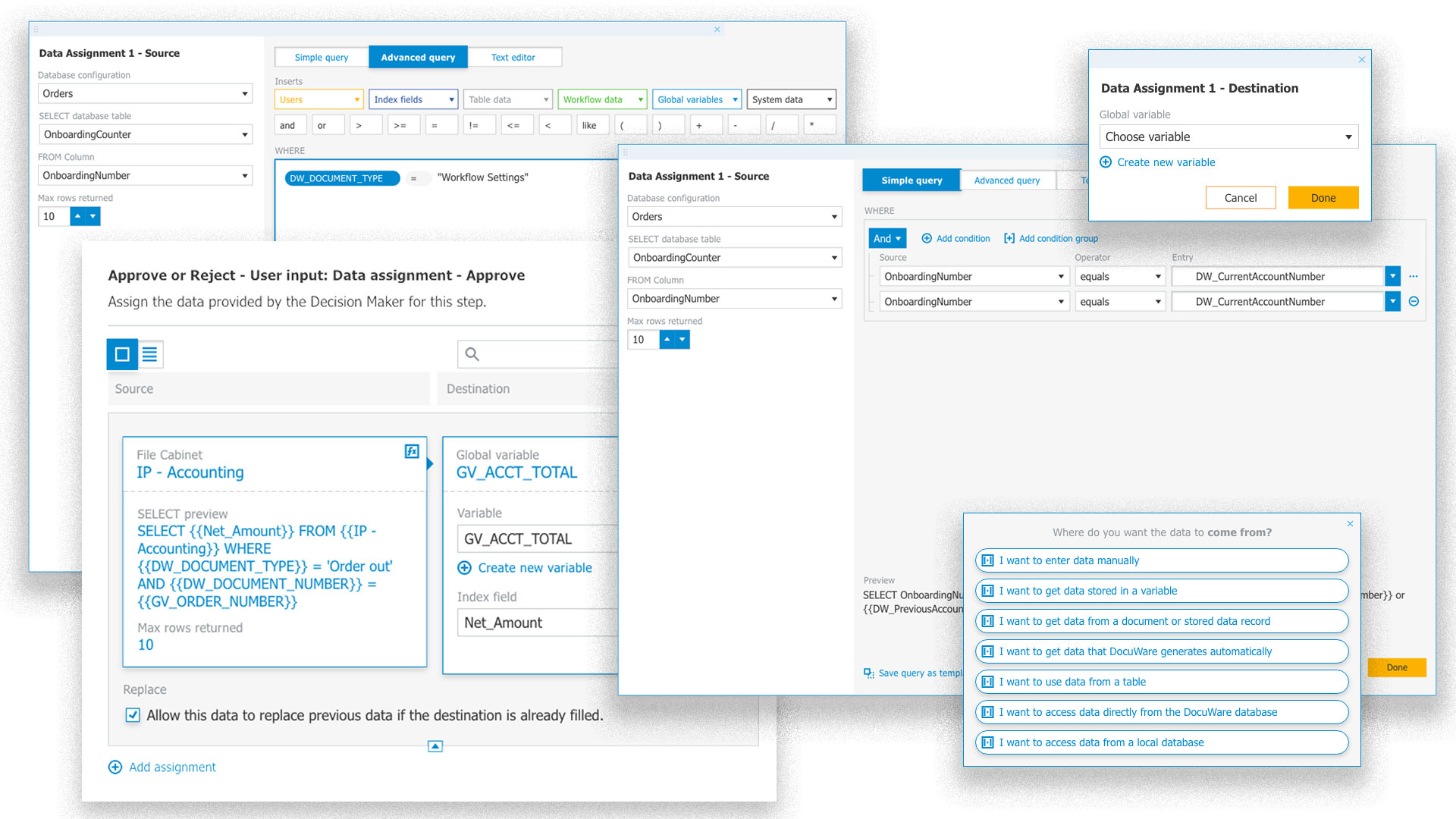
Example 2: Data Assignment
Because the Designer has complex data assignment capabilities, I wanted to help users fully understand their options.
“Make the arrow between source and destination a bit more obvious. This would make it clearer.”
I became clear that users could make decisions more quickly with a “source to destination” orientation, instead of “destination to source”. Additionally, I created a method to guide users through a simple wizard if desired. Finally I was able to help users avoid errors by providing a query builder for deep data, instead of requiring them to write SELECT clauses straight to our database.
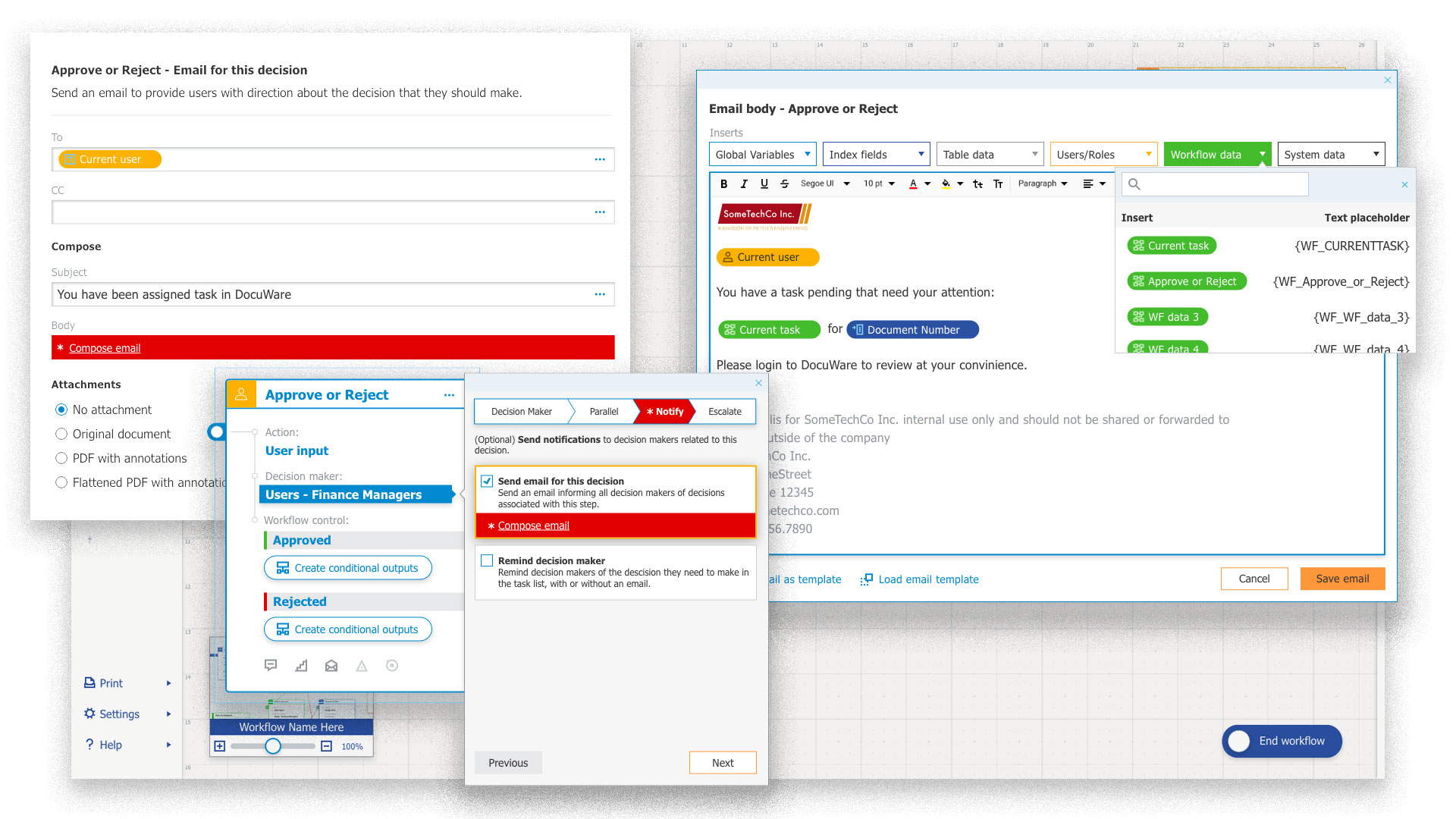
Example 3: Notifications
I wanted to know the most frequent use cases for sending notifications, and to know what users felt was difficult or missing for notification composition.
“[Text editing] might be difficult for users, almost like HTML coding. You have to know what you are doing!”
I found that users typically used task related emails for internal notifications, and separate single notifications for external recipients. So I created multiple additional dynamic elements that could be inserted into emails for those use cases. I also used object based composition instead of pure text solutions to help avoid errors. And I added the ability for users to better style content and add images.
Heuristic evaluation
Whenever I felt as though my wireframes or prototypes were in a place that needed immediate review, I would request a heuristic evaluation from one of my peers. I could quickly address issues that I may have overlooked or been unaware of. Each of these evaluations would break down issues and points of delight and give them a priority level. This prioritization helped me decide where to best focus my efforts within time or resource constraints.
Final round… Go!
Summative testing provides a system usability score which is a benchmark to see how well the new solution works. Since we followed internal proceeds closely for most of the priority challenges, we consistently scored above expected thresholds and beyond.
ADDITIONAL RESULTS
During tests and interviews, users found the new designs and features to be more inviting, modern, and less daunting. Important information and user choice summaries became much easier to discover and understand.
KPIs AND OKRs
Without benchmarks, it is difficult to determine the level of success of any new solutions in comparison to previous products. Our UX researcher was tasked with evaluating the overall experience of the existing desktop version of the workflow designer in multiple areas. This gave us base quantitative understanding to provide insight during the defining of our NorthStar KPI as well as additional KPI’s to support it. As of this writing the new workflow designer has not been released, so there are no updated KPI metrics for comparison. But given the general outcome of our direct contact with users we believed the product was in a great position to exceed our initial baseline numbers. Actual results cannot be shown here due to being proprietary. I may be able to provide additional information if you contact The Machine directly.
It was easier for users with less experience with the existing workflow designer to understand some new concepts than for those who had built complex workflows and developed their own particular methods. But once the core concepts were understood, the Qualitative responses were overwhelmingly positive during testing. We could have included some forms of onboarding earlier in the project to help alleviate this.
The project began during the infancy of DocuWare’s growth path towards User Centered Design. There are unforeseen growing pains that come with moving from waterfall to agile processes, and away from development focused decision making those previous solutions were built on. Project management strategies could be better communicated to and agreed upon be all team members before work begins.
The longevity of the project meant internal policy, process changes, and staff movement that mixed to cause communication and accountability to shift continually. A well-defined plan for these areas from the outset would have prevented some considerable issues later in the project.
I found that it was more beneficial for this project to test early than it was to spend too much time and effort developing a research plan and extensive hypotheses. Starting quickly with a general idea and wireframe iteration tends requires fewer man-hours and less mental load on the designer and other stakeholders.